Before you can even think about boosting your conversion rates, you have to get your bearings.
It’s tempting to jump right in and start tweaking button colors or A/B testing headlines, but that’s just throwing spaghetti at the wall.
Real, sustainable growth comes from a methodical approach, not random guesswork.
This initial groundwork is about understanding where you stand right now.
It’s where we move from a vague wish like “get more sales” to a clear, data-backed plan that will actually get you there.
What Are You Actually Trying to Achieve?

First things first: what does a “conversion” even mean for your business? It’s not a universal term.
For an e-commerce site, the big win—the macro-conversion—is a completed sale.
But for a SaaS company, it might be a demo request. For a blogger, it’s probably a newsletter signup.
Pinpoint that one critical action a visitor can take. That’s your north star.
But don’t stop there. Think about all the smaller steps a user takes on their way to that main goal.
These are your micro-conversions, and they tell a huge part of the story.
- Adding a product to the cart: This shows clear buying intent.
- Downloading an ebook: You’ve just captured a potential lead.
- Watching a demo video: The user is actively engaged and learning.
- Creating an account: A big step toward becoming a repeat customer.
Tracking both macro and micro-conversions gives you a full picture of the customer journey.
You’ll see exactly where people are succeeding and, more importantly, where they’re getting stuck and dropping off. This insight is gold for a focused CRO program.
To learn more about how this connects to your broader marketing efforts, you might be interested in our guide on https://www.postpaddle.com/blog/how-to-develop-content-strategy.
Finding Your Starting Line: The Performance Baseline
Okay, you know what you’re measuring. Now, how are you actually doing? It’s time to dive into your analytics—Google Analytics is the classic choice—and establish your baseline.
This isn’t just about finding a single number; it’s about understanding the story behind it.
For a little context, the average e-commerce conversion rate worldwide usually floats somewhere between 2.5% and 3.0%. More established players might see 3-4%.
Knowing these benchmarks helps you set realistic goals instead of chasing a fantasy.
Your real goal isn’t to hit some arbitrary industry average. It’s to know your own baseline and then relentlessly work to improve it.
A 10% lift on a 1% conversion rate is a massive win that flows directly to your bottom line.
Tracking the Metrics That Really Matter
With your goals set and your baseline established, the final piece of the puzzle is identifying the Key Performance Indicators (KPIs) that tell you the why behind your conversion rate.
These metrics give the narrative context. If you want a broader view on tactics, you can explore these top strategies to improve website conversion rates.
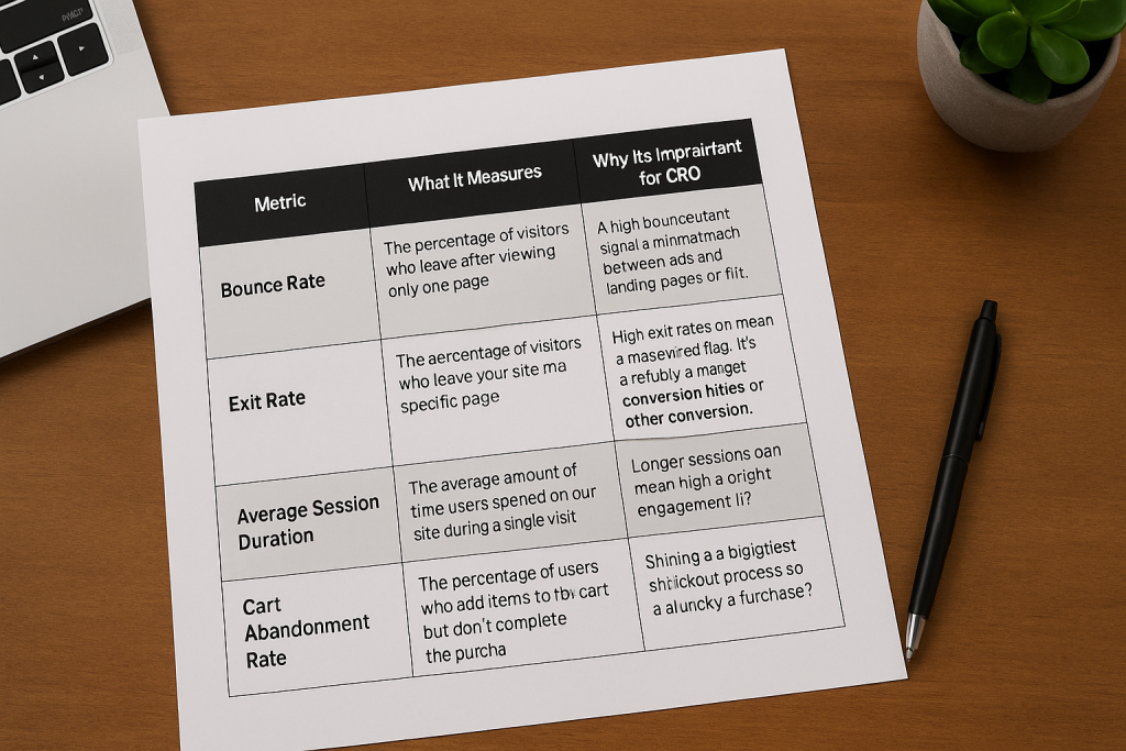
Key Conversion Metrics and Their Impact
To build a successful CRO program, you need to look beyond the final conversion number.
The table below breaks down the essential metrics that reveal what’s truly happening on your site.
| Metric | What It Measures | Why It’s Important for CRO |
|---|---|---|
| Bounce Rate | The percentage of visitors who leave after viewing only one page. | A high bounce rate can signal a mismatch between your ads and landing pages or just a poor user experience. |
| Exit Rate | The percentage of visitors who leave your site from a specific page. | High exit rates on checkout pages are a massive red flag. It points to friction, bugs, or other conversion killers. |
| Average Session Duration | The average amount of time users spend on your site during a single visit. | Longer sessions can mean high engagement, but you have to check this against conversion data to know for sure. |
| Cart Abandonment Rate | The percentage of users who add items to their cart but don’t complete the purchase. | This metric shines a spotlight directly on your checkout process. Are there unexpected costs? A clunky form? |
By keeping a close eye on these KPIs, you’re no longer guessing.
You’re making informed decisions based on real user behavior, which is the cornerstone of effective conversion optimization.
Understanding Your Audience and Their Journey
Let’s be honest. Trying to boost your website’s conversion rate without first getting inside your audience’s head is a total shot in the dark.
You can tweak buttons and change headlines all day, but you won’t see real, sustainable results until you truly grasp who your visitors are, what they’re trying to accomplish, and what’s getting in their way.

Basic demographics like age and location barely scratch the surface. They don’t tell you the why behind a user’s actions.
To really move the needle on conversions, you have to shift your perspective from just chasing the final sale to understanding the entire journey that leads up to it.
Seeing Your Website Through Their Eyes
Your analytics platform can be great at telling you what is happening. It might show that 70% of users are dropping off at the shipping page, but it won’t tell you why they’re leaving.
That’s where you need to go deeper with tools that show you the actual user experience.
These qualitative tools give you the visual evidence that raw numbers just can’t provide.
- Heatmaps: These are fantastic for showing you where people are clicking, scrolling, and hovering. I’ve seen heatmaps reveal that dozens of users were clicking on a static image, thinking it was a link. That’s an instant, easy-to-fix insight you’d never get from a spreadsheet.
- Session Recordings: Think of these as a DVR for your user’s visit. You can literally watch someone’s screen as they navigate your site. Watching a user get stuck in a frustrating loop during checkout or struggle to find the search bar is a powerful (and humbling) experience that provides a crystal-clear action item.
When you start analyzing this kind of visual data, you stop guessing and start seeing the exact friction points that are costing you money.
It’s the difference between knowing a page has a high exit rate and watching three different people rage-click a broken button before giving up.
Mapping the Complete Customer Path
No one just lands on a product page ready to buy. Every visitor is on a path, and each step is an opportunity to either guide them forward or lose them for good.
You have to map that journey to find the weak links in your conversion funnel.
The idea is to trace their steps from their very first interaction—maybe a Google search or a social media ad—all the way to a thank you page.
To get a handle on the different routes your audience takes, using a practical framework like a customer journey mapping template to boost conversions can be a huge help.
A simplified journey might unfold like this:
- Awareness: A user finds your brand through a helpful blog post.
- Consideration: They like what they see and sign up for your newsletter.
- Decision: An email promotion catches their eye, and they click through to a product page.
- Action: They add the item to their cart and complete the purchase.
Once you have this mapped out, you can critically examine each stage.
Is that blog post actually useful? Can they easily find the newsletter signup? Does the product page answer every potential question?
Every “no” is a conversion roadblock you need to clear.
Gathering Direct and Actionable Feedback
While behavioral tools show you what users do, sometimes the quickest way to understand their motivation is just to ask them.
Direct feedback provides the context—the why—behind their actions and reveals the core objections you need to overcome.
Don’t just focus on the people who convert. The most valuable feedback often comes from those who almost converted but didn’t. Understanding their hesitation is the key to unlocking future growth.
You can collect this crucial insight with a few straightforward methods:
- On-Site Surveys: A simple pop-up on a key page can work wonders. On the checkout page, ask something like, “Was there anything stopping you from completing your purchase today?” The answers can be eye-opening.
- Post-Purchase Questionnaires: After a customer buys, ask them what almost stopped them. You might uncover hidden anxieties about shipping costs, return policies, or payment security that you can immediately address for all future visitors.
When you combine the why from direct feedback with the what from your analytics and session recordings, you finally have the full picture.
This holistic view is what allows you to make smart, data-informed changes that solve real user problems and smoothly guide more visitors to that final click.
Optimizing Your Website for Speed and Trust

A slow website doesn’t just annoy visitors; it actively costs you sales.
Likewise, a site that feels unprofessional or insecure will send potential customers running for the digital hills.
Speed and trust are two of the most powerful, non-negotiable pillars of conversion rate optimization. Getting them right isn’t just a good idea—it’s foundational.
Think about your own experience. Every second you wait for a page to load, your frustration grows.
That initial spark of interest in a product quickly fizzles out, replaced by impatience.
If you finally land on a page that looks dated or lacks any security badges, are you really going to enter your credit card details?
Of course not. You’ll just click away and find a competitor who offers a smoother, safer experience.
Diagnosing and Fixing Performance Bottlenecks
First things first, you need to figure out how fast your site actually is.
You can’t fix what you don’t measure. Tools like GTmetrix are perfect for this, giving you a detailed performance report that breaks down exactly what’s slowing you down.
Here’s what one of those reports looks like. It grades your site’s performance and points to specific areas that need attention.

This report highlights key metrics like Largest Contentful Paint (LCP) and gives you a clear, actionable to-do list to boost your speed.
Once you have this baseline, you can zero in on the biggest offenders.
- Image Optimization: Nine times out of ten, large, uncompressed images are the main culprit behind slow load times. Make sure every single image is compressed and served in a modern format like WebP. If you need a deep dive, check out our guide on how to optimize images for the web.
- Code Minification: This sounds technical, but it’s simple. It’s the process of removing unnecessary characters (like extra spaces and code comments) from your site’s HTML, CSS, and JavaScript files. Smaller files mean faster downloads.
- Leverage Caching: Caching is your best friend for repeat visitors. It stores parts of your site locally so that when someone comes back, their browser doesn’t have to reload everything from scratch. It’s a game-changer for perceived speed.
A mere 0.1-second improvement in load time can increase e-commerce conversions by 8.4%. The message is clear: even tiny speed gains deliver significant financial returns.
Building Unbreakable Trust with Your Audience
Speed gets visitors to stick around, but it’s trust that convinces them to buy. A lightning-fast website that looks untrustworthy is still going to have a conversion rate of zero.
You build trust through a combination of professional design and transparent signals that show you’re a legitimate, secure business that actually cares about its customers.
Your job is to preemptively answer the subconscious questions every visitor has: “Is this site safe?”, “Is this company for real?”, and “What happens if I have a problem?”
The Power of Social Proof and Security Signals
One of the quickest ways to build credibility is by showing that other people already trust you. This is the core principle of social proof, and it’s a powerful psychological trigger.
The research is staggering. Products with just five reviews are 270% more likely to be purchased. For high-ticket items, that number jumps to an incredible 380%. This is why you can’t afford to ignore it.
Here’s how you can put social proof and other trust signals to work on your site:
- Display Customer Testimonials Prominently: Don’t bury your best reviews on a separate page. Place glowing quotes from happy customers right next to your call-to-action buttons. Including a headshot and their name makes them feel far more authentic.
- Showcase Security Badges: Display logos from security providers like Norton or McAfee, especially on your checkout pages. These are instant visual cues that tell users their data is safe with you.
- Be Transparent with Policies: Make your return policy, shipping information, and privacy policy ridiculously easy to find. If people feel like you’re hiding this information, they’ll assume the worst.
- Use “As Seen On” Logos: Has your brand been featured in a well-known publication? Add those logos to your homepage. This is a classic move that “borrows” their authority and transfers it directly to your brand.
By focusing on both speed and trust, you’re tackling two of the biggest psychological hurdles in the buying process.
You’re creating an environment where visitors feel comfortable, confident, and ready to become customers.
Nail Your Messaging: Crafting Killer CTAs and Value Propositions

Let’s be blunt: the words on your website are your best salespeople.
You can pour money into a lightning-fast, beautiful site, but if your messaging fails to connect—and fails to tell people what to do next—your conversion rates will completely stall out.
This is where your value proposition and your calls-to-action (CTAs) become mission-critical.
They’re a tag team that answers the two most important questions on every visitor’s mind: “Why you?” and “Now what?”
If you get these two things right, you’ll start turning passive visitors into paying customers.
First Things First: What Problem Are You Really Solving?
Before you even think about button copy, you have to get your value proposition crystal clear.
This is the simple, powerful statement that explains the specific benefit someone gets from your product.
It’s not a catchy slogan; it’s the core promise you’re making.
A weak value proposition is vague, generic, and stuffed with corporate jargon.
A strong one, on the other hand, speaks directly to a customer’s real-world frustration and offers a tangible solution.
The difference is stark:
- Weak: “Innovative synergy solutions for modern businesses.” (This says absolutely nothing.)
- Strong: “Stop wasting time on spreadsheets. Manage your entire project in one place.” (This hits on a specific pain point and offers a clear benefit.)
Your value proposition should be front and center, typically in your homepage hero section. It needs to immediately grab a visitor and make them think, “This is exactly what I’ve been looking for.”
Designing Calls-to-Action That Get Clicked
Once your value proposition has set the stage, the CTA is your closing argument. It’s the final push that guides a user toward taking action.
A truly effective CTA isn’t just a button—it’s a powerful mix of persuasive copy, smart placement, and intentional design that makes the next step feel like a no-brainer.
Forget the endless debates about the “best” button color for a minute. Yes, contrast matters for visibility, but the words on the button carry far more weight.
For a deeper dive on visual psychology, you can check out our guide on the best colors for marketing.
A CTA isn’t just a button; it’s the culmination of your entire argument. It’s where you ask for the conversion, so the language you use must be clear, compelling, and directly tied to the value you just promised.
Use Action-Oriented Language, Always
The most common mistake I see people make is falling back on passive, generic button text.
Words like “Submit,” “Click Here,” or “Learn More” are conversion killers because they don’t convey any value.
What is the user actually getting when they click?
The fix is simple: use action-oriented language that completes the sentence, “I want to…”
Here’s how that small change makes a massive difference:
| Generic CTA | Action-Oriented CTA |
|---|---|
| Submit | Get My Free Quote |
| Download | Send Me the Ebook |
| Continue | Create My Account |
See the difference? The action-oriented examples are specific and laser-focused on the user’s benefit.
This simple tweak can give your click-through rates a serious boost because it eliminates ambiguity and reinforces the value they’re about to receive.
Your CTA should feel like the logical conclusion to the page—the obvious next step in their journey, not an awkward demand.
When you align a powerful value proposition with a compelling, action-driven CTA, you create a smooth, confident path that guides users directly from interest to action.
Implementing a Strategic Testing Framework

Relying on gut feelings or the latest design trends to guide your website changes is a recipe for stagnation.
If you’re serious about boosting your website’s conversion rates, you have to move away from a culture of guessing and embrace disciplined, data-driven testing.
This isn’t about running a few random experiments here and there. It’s about building a repeatable process where every single change is a controlled experiment.
The goal? To learn something valuable about your audience that leads to continuous, incremental growth.
A/B Testing vs. Multivariate Testing
First things first, you need to choose the right tool for the job.
The two main methods you’ll encounter are A/B testing and multivariate testing, and they serve very different purposes.
Deciding between them comes down to what you want to learn and how much traffic you have to work with.
Let’s break down the key differences.
A/B Testing vs. Multivariate Testing
| Feature | A/B Testing | Multivariate Testing |
|---|---|---|
| Concept | Compares two or more distinct versions of a single page element. | Tests multiple variations of several elements on one page simultaneously. |
| Goal | To find a clear winner between different versions (e.g., Headline A vs. Headline B). | To understand which combination of elements performs best and identify the individual impact of each element. |
| Complexity | Simple to set up and analyze. | More complex, requires more traffic and sophisticated analysis. |
| Best For | High-impact changes like headlines, CTAs, hero images, and page layouts. | Optimizing high-traffic pages like landing pages or checkout flows where small changes can compound. |
| Traffic Needs | Lower traffic requirements to reach statistical significance. | Requires significantly higher traffic to test all combinations effectively. |
For most businesses just getting started with optimization, A/B testing is the way to go. It delivers cleaner, more decisive results without needing massive amounts of traffic.
Get comfortable with this process before you even think about diving into the complexities of multivariate experiments.
Build a Hypothesis Rooted in Data
A solid test always starts with a solid hypothesis. And a solid hypothesis is never just a random guess—it’s an educated, data-backed statement that comes directly from the user research you’ve already done.
Your heatmaps, session recordings, and user surveys are a goldmine for testing ideas. Did you see users repeatedly rage-clicking on a non-linked image in your recordings? That’s a perfect starting point.
Your hypothesis might be: “By making the hero image a clickable link to our product page, we can reduce user frustration and increase click-throughs by 15%.”
A proper hypothesis should always follow this structure: Because we observed [data/insight], we predict that changing [element] will result in [outcome]. We will measure this using [metric].
This simple format forces you to justify every test with real data, making sure you’re always solving a real problem instead of just changing things for the sake of it.
Run a Clean and Valid Experiment
Once your hypothesis is locked in, running a clean test is crucial for getting trustworthy results.
The biggest mistake I see people make is ending a test too early just because one variant shoots ahead after a few days. Don’t do it.
To achieve statistical significance—which is typically a confidence level of 95% or higher—you need two things: enough conversions and enough time.
You should always let your test run for at least two full business cycles (so, two full weeks) to account for the natural swings in user behavior between weekdays and weekends.
It’s also essential to remember that not all traffic is created equal. Conversion rates can vary wildly depending on where your visitors come from.
For instance, recent conversion rate optimization statistics show that direct traffic often has the highest conversion rate at 3.3%, and can even hit 5.3% in industries like healthcare.
Paid search, on the other hand, averages 3.2% but can go as high as 5.2% in financial services or drop to just 0.9% in B2B tech. This is why you have to segment your results during analysis.
The image below shows a clear example of an A/B test result, comparing the conversion rates of two different page versions.
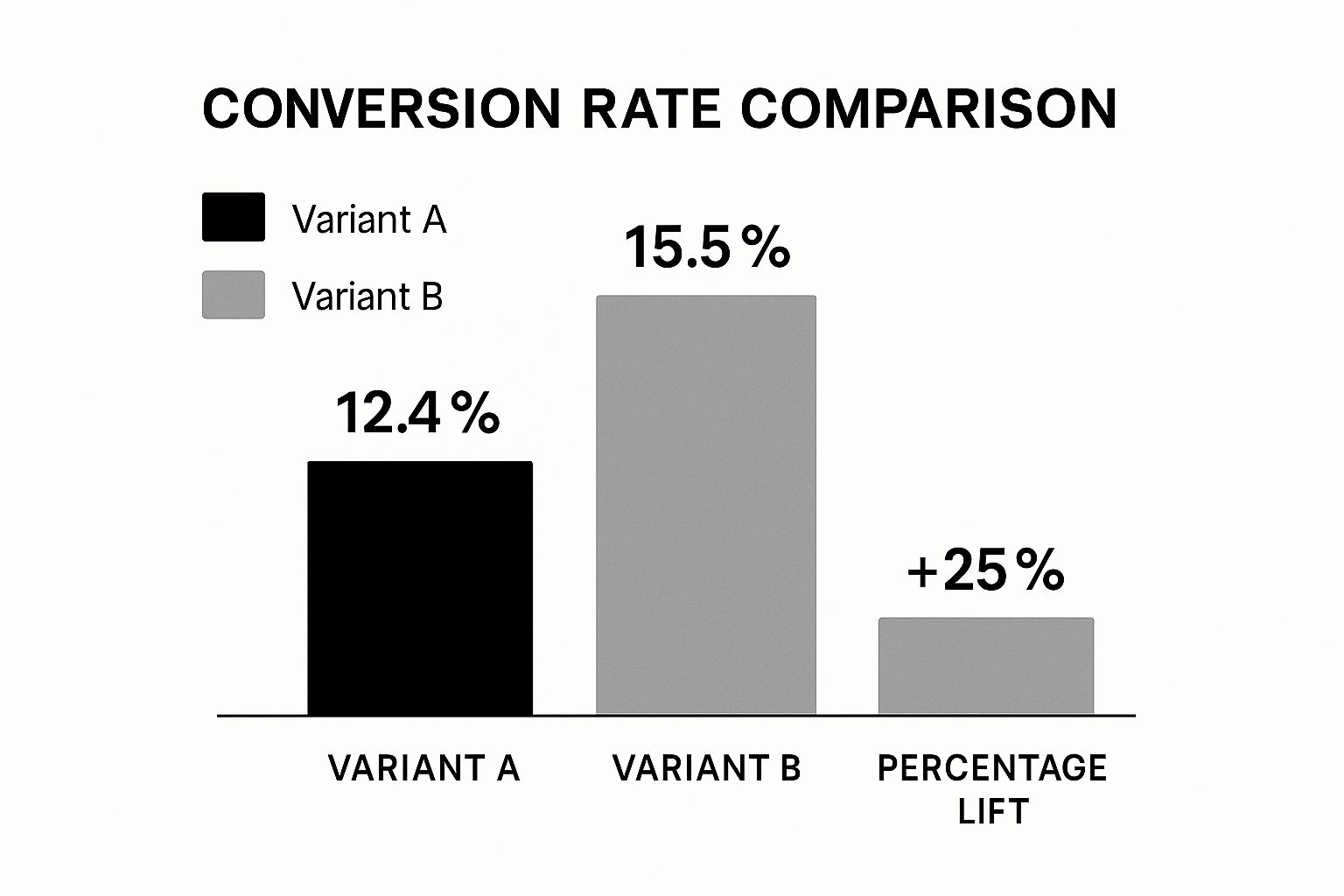
As you can see, Variant B delivered a much higher conversion rate.
This gives you a clear winner and the confidence to roll out the change permanently.
Turn Test Results into Lasting Wins
The goal of testing isn’t just to find a winner; it’s to learn.
After every test—whether it won, lost, or was inconclusive—you have to dig in and analyze the outcome.
If your new headline won, ask why. Was the language more direct? Did it tap into a customer pain point more effectively? These are the insights that matter.
Document every single test result. This creates an invaluable knowledge base for your entire team, which helps you avoid repeating past mistakes and allows you to build on previous successes.
This feedback loop—research, hypothesize, test, and learn—is the engine that powers sustainable growth for the long haul.
Turn Pinterest Traffic into Conversions, Not Just Clicks
You’ve tightened up your pages, clarified your value proposition, and started testing your CTAs—now it’s time to fix what happens before visitors land on your site.
If your Pins are vague, off-topic, or overpromise compared to your landing page, even the best-optimized website will struggle to convert.
Post Paddle’s free Pin Checklist helps you align your Pinterest creatives with your offers: clear promise, relevant imagery, strong call-to-action, and keyword targeting that attracts the right people, not just more people.
That kind of message match is exactly what lifts add-to-cart rates, signups, and demo requests.
Before you run your next CRO test, run your Pins through the checklist and make sure every click arriving from Pinterest is primed to say “yes.”
Diving Deeper: Your Top Website Conversion Rate Questions Answered
Once you start digging into conversion rate optimization, the questions start flying. How long do I run a test?
What’s even a good rate to aim for? It’s completely normal. Getting a handle on the specifics of testing and setting realistic goals is what separates a frustrating effort from a strategy that actually moves the needle.
Let’s break down some of the most common questions I hear from people just starting to get serious about improving their website’s performance.
What Is a Good Website Conversion Rate?
This is the big one, and the honest-to-goodness answer is… it’s complicated. A “good” conversion rate is completely relative.
It depends on your industry, what you’re selling, your price point, and even where your traffic is coming from. A B2B company selling six-figure software will have a vastly different conversion rate than an e-commerce store selling $20 t-shirts.
While you’ll often hear a general e-commerce average floating around 2-3%, getting hung up on that number is a mistake.
The best approach? Stop worrying about industry benchmarks and start focusing on your own.
Your most important benchmark is your own current conversion rate. The real goal isn’t to chase some arbitrary number but to see consistent, measurable growth from your baseline.
A jump from 1% to 1.2% might not sound like much, but that’s a 20% increase in conversions, and that’s a real impact on your revenue.
How Long Should I Run an A/B Test?
Patience is a virtue in A/B testing. I’ve seen so many people kill a test early because one version shot out to an early lead. That’s a huge—and expensive—mistake.
The whole point is to collect enough data to be confident your results aren’t just a fluke. In technical terms, you’re aiming for statistical significance, which is usually a confidence level of 95% or more.
So, how long is long enough?
As a rule of thumb, plan for at least two full business weeks. This gives you enough time to smooth out the natural highs and lows in user behavior.
Think about it: someone browsing your site on a lazy Sunday afternoon behaves very differently than someone trying to make a quick purchase on a Tuesday morning. You need to capture both.
- For lower-traffic sites: You might need to let the test run for three or even four weeks to get enough data for a reliable result.
- For high-traffic sites: Even if you hit statistical significance in a couple of days, resist the urge to stop. Let it run the full two-week cycle to make sure your decision is based on a complete picture, not just a short-term trend.
What Website Elements Should I Test First?
With so many things you could test, where do you even begin? It’s easy to get analysis paralysis. To get the most bang for your buck right out of the gate, put your energy into high-traffic pages and the elements that are closest to the money.
A small tweak in these critical spots can lead to a surprisingly big win.
Think in terms of potential impact. Here’s a solid game plan for your first few tests:
- The Homepage Headline & Hero Image: This is your digital handshake. It’s the first thing visitors see. Nailing your value proposition here can slash your bounce rate and pull people deeper into your site.
- Primary Call-to-Action (CTA) Buttons: Look at the main “action” buttons on your product pages or service pages. Experiment with the copy, color, and placement. Something as simple as changing a generic “Submit” to a specific “Get My Free Quote” can work wonders.
- The Checkout or Lead Form Process: This is the final step, and it’s where a ton of conversions go to die. If you have a high cart abandonment rate, this is your prime suspect. Try removing form fields that aren’t absolutely necessary, show shipping costs upfront, or add trust badges to calm any last-minute jitters.
By starting with these high-leverage elements, you’re stacking the deck in your favor. You’ll see meaningful results faster, which builds the momentum you need to create a true culture of optimization.