
Choosing the right colors for your marketing is not just an aesthetic decision; it’s a critical business strategy rooted in human psychology.
The colors you use can dramatically influence perception, trigger specific emotions, and drive consumer behavior, ultimately impacting your conversion rates and brand loyalty.
In a crowded digital space, especially on visually-driven platforms like Pinterest, the right color can stop a user mid-scroll, convey your message in a fraction of a second, and make your brand instantly memorable.
Understanding this psychological impact is a fundamental principle that expert marketing firms leverage, often by partnering with specialized agencies to fully develop a brand’s powerful visual identity.
This guide moves beyond generic advice to provide a deep dive into the 7 best colors for marketing.
We will explore the specific emotional triggers of each color, identify which industries can best leverage their power, and showcase real-world examples of high-performing Pinterest pins.
You’ll gain actionable insights to build a color strategy that resonates with your target audience and achieves your marketing goals, turning your visual content into a powerful conversion tool.
Get ready to transform your brand’s palette from a simple design choice into a strategic asset.
How to Use These Marketing Colors Strategically
Before we break down each shade, remember that no color works in isolation. Your palette should reflect your positioning, audience, and platform.
The seven options below aren’t rigid rules, but proven starting points you can combine, test, and adapt to your brand in 2026.
1. Red – The Color of Action and Urgency
When it comes to the best colors for marketing, red is an undeniable powerhouse. It’s a primary color that evokes strong, primal emotions, making it one of the most visible and impactful hues in the spectrum.
Physiologically, red has been shown to increase heart rate and create a sense of urgency, making it a go-to choice for brands aiming to prompt immediate action.
Red communicates energy, passion, excitement, and danger. This psychological association is why it’s so effective for clearance sales, limited-time offers, and critical call-to-action (CTA) buttons like “Order Now” or “Click Here.”
Brands like Coca-Cola and Target have built entire empires on the back of this color, using it to create instant recognition and a memorable brand identity.
Netflix masterfully uses its red logo and interface elements to encourage action, subtly urging users to start the next episode.
Why Red Works in Marketing
Red’s effectiveness is rooted in its ability to grab attention instantly. It cuts through visual noise, making it ideal for competitive environments.
- Drives Urgency: The color stimulates the adrenal gland, creating excitement and a feeling that time is running out. This is perfect for flash sales or last-chance promotions.
- Encourages Appetite: Red is known to stimulate the appetite, which is why it’s a favorite in the fast-food industry. Think McDonald’s, KFC, and Pizza Hut.
- Promotes Action: As the color of energy, it encourages physical responses. YouTube’s iconic red play button is a perfect example, acting as a powerful visual cue to engage with content.
For a quick reference on red’s marketing impact, this summary box highlights key data points.
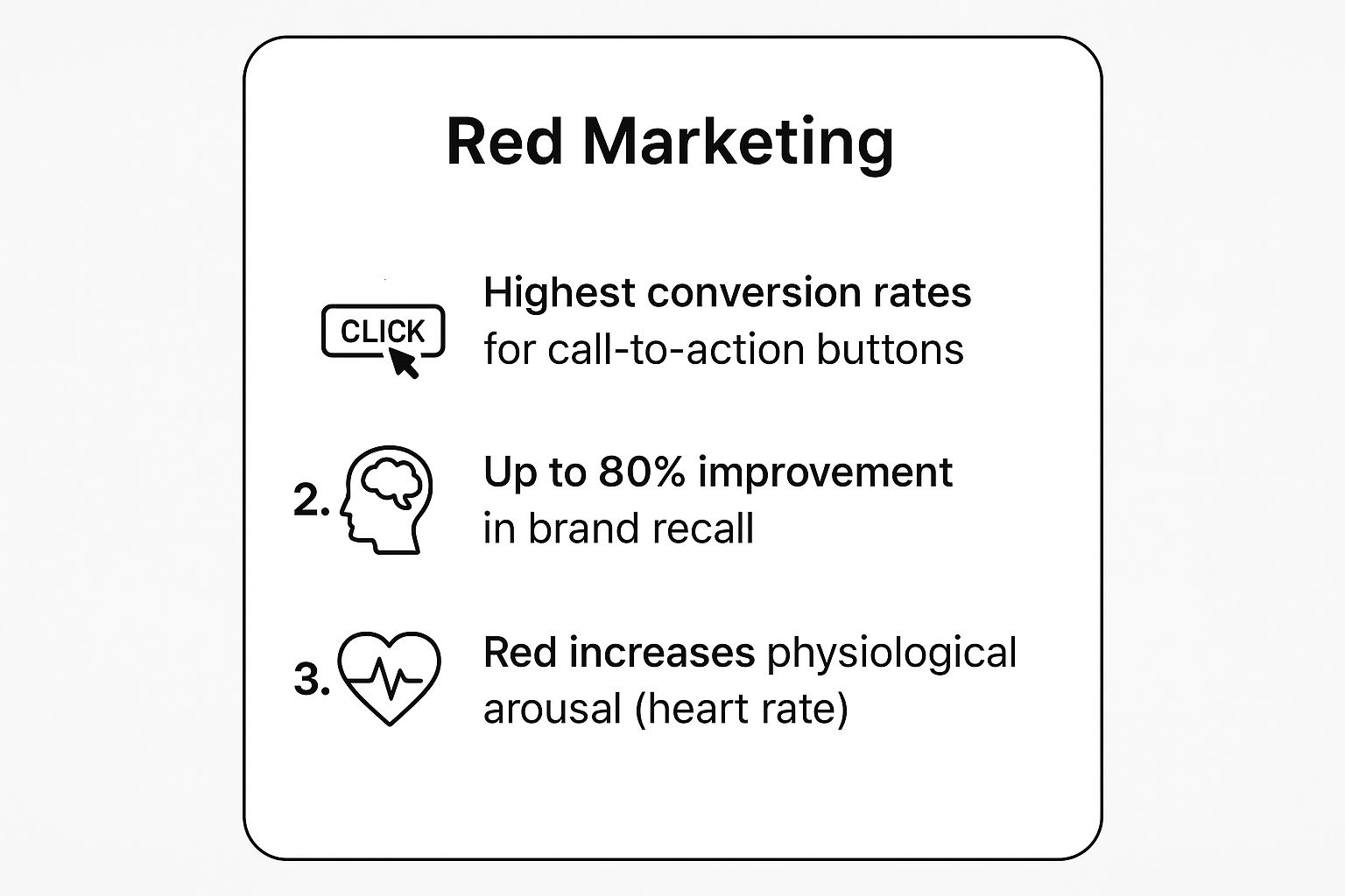
These metrics show that red doesn’t just feel urgent; it translates directly into higher conversion rates and stronger brand recall.
How to Use Red Effectively
While powerful, red can be overwhelming if overused. It can also signify aggression or warning, so strategic implementation is key.
Key Insight: Use red as a strategic accent, not a dominant background. Reserve it for the most important elements you want your audience to interact with, such as CTAs, sale announcements, or key highlights in an infographic.
Pairing it with neutral colors like white, black, or gray creates a balanced and high-contrast design that improves readability.
Consider testing different shades. A bright, true red creates maximum urgency, while a deeper maroon or burgundy can feel more sophisticated and luxurious.
Always consider the cultural context, as red carries different meanings worldwide.
2. Blue – The Trustworthy Professional
Where red ignites action, blue inspires confidence. As one of the most popular and universally liked colors, blue is a cornerstone in the world of marketing, conveying stability, harmony, trust, and professionalism.
Psychologically, blue has a calming effect, lowering blood pressure and creating a sense of security and order.
This makes it an invaluable asset for brands that need to establish credibility and build long-term customer relationships.

This color is the undisputed champion for corporate, financial, and tech industries. Giants like IBM (nicknamed ‘Big Blue’), PayPal, and American Express leverage blue to communicate reliability and secure handling of sensitive information.
Social media platforms like Facebook and LinkedIn use blue to create a dependable and non-intrusive environment, encouraging users to connect and share. This fosters the kind of trust that is vital for consistent user engagement.
For those looking to build a strong community, understanding how to improve social media engagement on Postpaddle.com is a great next step.
Why Blue Works in Marketing
Blue’s marketing power comes from its ability to build subconscious trust and project an image of competence. It’s a color that says “we are reliable and here to stay.”
- Builds Trust and Security: Blue is the top choice for banks, insurance companies, and healthcare providers because it makes consumers feel safe and secure.
- Creates a Sense of Calm: Unlike aggressive colors, blue is mentally soothing. This is ideal for complex products or services that require customer deliberation, such as software or high-tech gadgets.
- Promotes Productivity and Focus: Blue is often associated with logic and communication, making it a fitting choice for B2B brands and professional networking platforms.
How to Use Blue Effectively
While versatile, the wrong shade of blue can feel cold, distant, or unappetizing. Its application must align with the brand’s core message.
Key Insight: Select your shade of blue carefully. A deep navy or royal blue conveys corporate power and luxury, ideal for financial services or premium products.
A lighter sky blue feels more serene and friendly, working well for wellness brands, cleaning products, or social platforms. Avoid using blue for food-related marketing, as it can act as an appetite suppressant.
Combine blue with complementary colors like white or gray for a clean, modern, and professional look. For a touch of energy, pair it with an accent color like orange or yellow.
This contrast can make key elements, like a “Sign Up” button, stand out without sacrificing the overall feeling of trust.
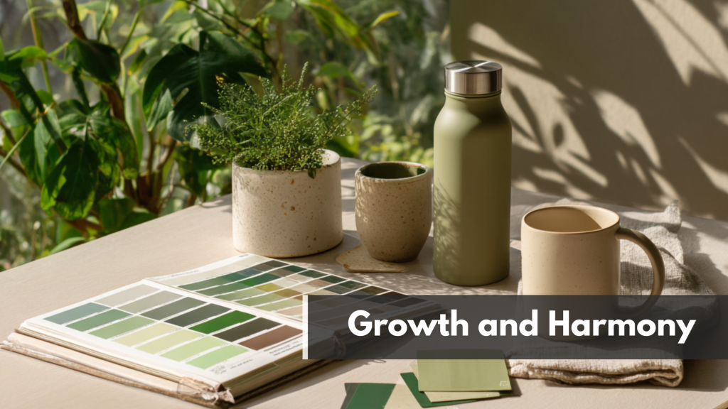
3. Green – The Color of Growth and Harmony
As the most restful color for the human eye, green is a versatile and powerful choice in marketing. It embodies harmony, growth, nature, and health.
Psychologically, it evokes feelings of balance, freshness, and serenity, making it a calming presence in a cluttered digital landscape.
This strong association with the natural world makes it an automatic choice for brands focused on sustainability, wellness, and organic products.
Green’s connection to prosperity and wealth also makes it one of the best colors for marketing in the financial sector.
Brands like TD Bank use green to suggest financial growth and stability. Meanwhile, tech giants like Spotify use a vibrant green to feel fresh, modern, and encourage discovery.
In the food and beverage industry, Starbucks’ iconic green logo communicates a natural, premium experience, while Whole Foods leverages it to underscore its commitment to organic, healthy living.
Why Green Works in Marketing
Green’s effectiveness lies in its dual association with nature and prosperity, creating a sense of trust and well-being. It’s a color that signals safety and positivity.
- Promotes Calm and Health: Its calming effect makes it ideal for healthcare, wellness, and therapeutic brands. It soothes and reassures customers, building a sense of trust.
- Signifies Growth and Wealth: From finance to agriculture, green is the color of growth. John Deere’s iconic green machinery represents agricultural reliability and productivity.
- Implies ‘Go’ or ‘Proceed’: Much like a traffic light, green is a universal symbol for permission and forward movement. This makes it an excellent, non-aggressive choice for call-to-action buttons.
How to Use Green Effectively
The shade of green you choose can dramatically alter its message. Bright, zesty greens feel energetic and eco-conscious, while darker, richer shades evoke prestige and tradition.
Key Insight: Use green to build trust and communicate your brand’s core values, whether they are rooted in nature, health, or financial stability.
Pair it with neutral colors like white or beige for a clean, organic look that reinforces a message of simplicity and transparency. For CTAs, a bright green can outperform red in contexts where urgency isn’t the primary goal.
Consider your industry. A light, mint green works well for a spa or wellness app, while a deep forest green can lend a sense of heritage and luxury to a brand like Land Rover.
Always test how different greens resonate with your specific audience to ensure your message is clear and effective.
4. Orange – The Enthusiastic Motivator
Orange brilliantly combines the high-energy jolt of red with the cheerful optimism of yellow. This fusion creates a color that radiates enthusiasm, creativity, and confidence.
It’s less aggressive than red but still packs a powerful, energetic punch, making it one of the best colors for marketing strategies aimed at appearing friendly, approachable, and fun while still compelling customers to act.
This vibrant hue signals affordability and adventure. Brands like The Home Depot use orange to embody a “can-do” spirit of DIY projects, while Amazon’s iconic orange smile suggests customer satisfaction and a seamless shopping journey.
Similarly, Harley-Davidson leverages orange to represent freedom and the open road, and Fanta’s branding perfectly matches the energetic, fruity nature of its products. It’s a color that says “get started” in a warm, inviting way.
Why Orange Works in Marketing
Orange stands out without being as alarming as red, making it a powerful tool for creating a positive, action-oriented atmosphere. It feels both dynamic and accessible.
- Drives Positive Action: Orange is excellent for call-to-action (CTA) buttons like “Subscribe” or “Buy Now” because it motivates without creating the intense urgency of red. It feels more like a friendly suggestion.
- Communicates Affordability: The color is often associated with value and cost-effectiveness, making it a smart choice for brands that want to appeal to a broad, budget-conscious audience.
- Builds Trust and Enthusiasm: Its cheerful nature can make a brand feel more youthful, confident, and engaging. Nickelodeon built its entire identity on this playful, energetic vibe.
How to Use Orange Effectively
The key to using orange is balance. Its boldness can easily dominate a design, so it’s often best used as a powerful accent rather than the main background color.
Key Insight: Pair orange with a cool, professional color like blue to create a high-contrast, balanced design that communicates both energy and reliability.
This combination is particularly effective in tech and finance, where brands like ING Bank use it to appear modern and differentiate from traditional, more conservative competitors.
For maximum impact, use orange for elements you want to draw immediate attention to. This includes highlighting new features, special offers, or key subscription prompts.
A bright, vibrant orange works well for youth-focused brands, while a deeper, burnt orange can convey a sense of adventure or autumn seasonality.
Always test its impact on your specific audience to ensure it aligns with your brand’s core message.
5. Purple – The Luxury and Creativity Symbol
Historically associated with royalty and nobility, purple has long been a symbol of luxury, power, and wealth. This association stems from the extreme rarity and expense of Tyrian purple dye in ancient times.
In modern marketing, this color retains its connection to sophistication and premium quality, but has also become a powerful emblem of creativity, imagination, and wisdom.
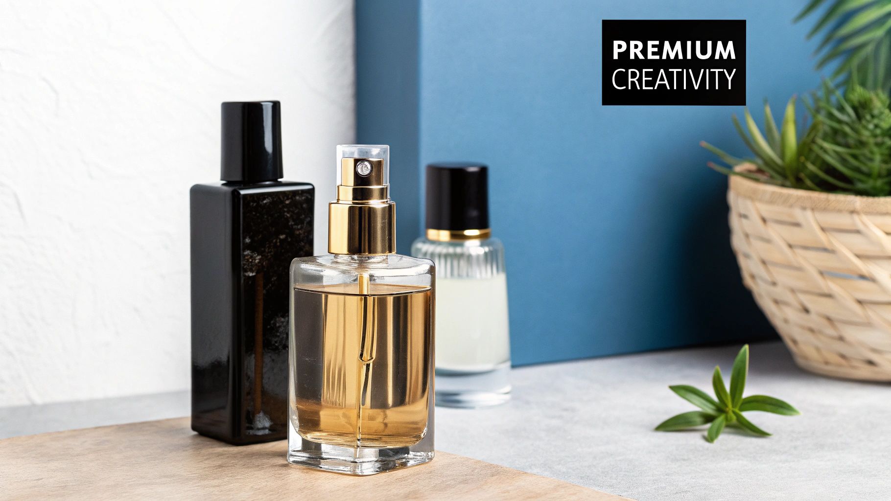
This dual meaning makes purple one of the most versatile and best colors for marketing, capable of appealing to both high-end consumers and imaginative audiences.
Brands like Cadbury leverage a rich purple to give their chocolate a premium, indulgent feel, while Twitch uses a vibrant, energetic purple to cultivate a community centered on digital creativity and entertainment.
Similarly, the iconic purple bag of Crown Royal whiskey instantly communicates luxury and quality.
Why Purple Works in Marketing
Purple’s effectiveness lies in its ability to blend the calm stability of blue with the fierce energy of red.
This unique mix creates a sense of intrigue and sophistication that can make a brand appear both authoritative and innovative.
- Communicates Premium Quality: The color immediately suggests exclusivity and high value, making it ideal for luxury goods, high-end services, and beauty products.
- Sparks Creativity: Lighter shades like lavender and violet are often linked to lightheartedness, nostalgia, and imagination, resonating with artistic and creative brands.
- Stands Out from Competitors: Purple is used less frequently in branding than colors like blue or red, allowing companies to easily differentiate themselves in a crowded market.
By using purple, brands can tell a compelling visual story that positions their products as both special and aspirational.
To dive deeper into this concept, learn more about the visual storytelling techniques on PostPaddle.com.
How to Use Purple Effectively
The key to using purple is to match the shade to your brand’s specific message. A deep, rich purple conveys luxury, while a brighter violet or lavender feels more creative and fun.
Key Insight: Use purple to target a specific, discerning audience. It’s perfect for brands that want to be perceived as forward-thinking, unique, or luxurious.
Pair it with complementary colors like gold or silver to amplify its opulent feel, or with white and grey for a clean, modern, and sophisticated look.
Because of its strong connotations, ensure purple aligns with your product and audience expectations. It works exceptionally well in the beauty, wellness, tech, and luxury goods industries.
For instance, Taco Bell has successfully used purple in campaigns to represent bold innovation and a departure from the fast-food norm.
6. Black – The Premium Authority
When exploring the best colors for marketing, black commands a unique position of power and sophistication. It is a color of substance, representing elegance, authority, and exclusivity.
Psychologically, black is perceived as timeless and luxurious, making it an essential tool for brands aiming to cultivate a premium, high-end identity.
It conveys a sense of seriousness and prestige that few other colors can match.
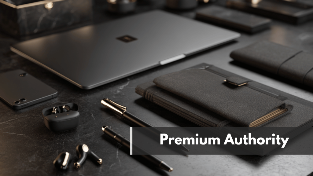
Black communicates control, luxury, and mystery. This strong association is why it’s the foundation for many luxury and tech brands.
Companies like Apple use black to showcase their products as premium, cutting-edge technology, while fashion houses like Chanel and Giorgio Armani build their entire brand mystique around its elegant simplicity.
Uber’s black branding positions its premium service as professional and sophisticated, differentiating it from more casual competitors.
Why Black Works in Marketing
Black’s power lies in its ability to create high contrast and confer a feeling of weight and importance. It acts as a perfect, non-distracting canvas that makes other elements, especially text and other colors, stand out sharply.
- Establishes Authority: Black is inherently authoritative and strong. Nike’s iconic swoosh in black is a symbol of athletic dominance and serious performance.
- Creates a Sense of Luxury: The color is inextricably linked to exclusivity and high value. Mercedes-Benz uses black extensively to symbolize prestige and superior engineering.
- Improves Readability and Focus: When used as a background, black helps other colors pop. As a text color on a light background, it offers maximum readability, a crucial factor in digital design.
How to Use Black Effectively
While incredibly effective, an overuse of black can feel oppressive or even menacing. The key is to use it with intention to create a specific, desired atmosphere.
Key Insight: Use black to frame your brand’s most valuable products or to create a sleek, modern user interface. Pair it with white for a classic, high-contrast look that never goes out of style.
For a touch of opulence, combine it with metallic colors like gold or silver. In web design, using black for negative space can create a dramatic and focused user experience.
Consider the texture and finish. A matte black can feel modern and understated, while a glossy black appears more sleek and luxurious.
Always balance black with lighter colors to avoid overwhelming the viewer and to ensure your design feels accessible, not intimidating.
7. Yellow – The Optimistic Attention-Grabber
As the most visible color in daylight, yellow is an unparalleled attention-grabber. It’s a color radiating positivity, happiness, and youthful energy, making it a powerful choice among the best colors for marketing.
Physiologically, yellow stimulates mental processes and encourages communication, creating an atmosphere of cheerfulness and clarity.
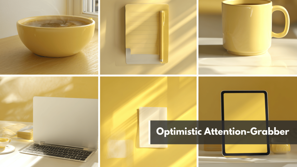
Yellow communicates optimism, creativity, warmth, and intellect. Its psychological association with sunlight and joy makes it highly effective for brands aiming to appear friendly, accessible, and innovative.
Iconic brands like McDonald’s use its golden arches to evoke feelings of happiness and create appetite appeal, while Best Buy’s yellow tag has become synonymous with value and great deals.
Snapchat leverages yellow to represent fun, ephemeral communication, and National Geographic’s iconic yellow border frames a world of exploration and discovery.
Why Yellow Works in Marketing
Yellow’s marketing power comes from its ability to stand out while evoking positive feelings. It’s a beacon that draws the eye and lifts the spirit.
- Commands Attention: As the most luminous color, yellow is perfect for highlighting key information. It’s ideal for call-to-action buttons, sale tags, and any element you need customers to see first.
- Sparks Creativity: Yellow is associated with the logical side of the brain, stimulating new ideas and clear thinking. This makes it a great choice for brands in creative, tech, or educational fields. Post-it Notes’ signature color is a perfect example of yellow fostering ideation.
- Builds Positive Associations: The color’s cheerful and energetic vibe helps create a friendly and approachable brand personality, making customers feel welcome and optimistic about their purchase.
When you’re creating compelling yellow-themed visuals, it’s also smart to think about how you can extend their reach.
Learning about effective content repurposing strategies can help you adapt your vibrant marketing assets for multiple platforms.
For more insights on this topic, explore these 9 content repurposing strategies on postpaddle.com.
How to Use Yellow Effectively
While cheerful, too much bright yellow can cause eye fatigue and feel overwhelming. The key is to use it strategically to guide attention.
Key Insight: Use yellow as a strategic highlight, not the main event. It excels as an accent color for CTAs, icons, or promotional banners.
Pairing it with a strong contrasting color like black or deep blue dramatically improves readability and makes the design pop.
Consider the shade carefully. A bright, sunny yellow is great for grabbing attention for sales and children’s products.
A more golden or mustard yellow can convey a sense of permanent value and intelligence, as seen with National Geographic. Avoid using it for text on a light background, as it can be difficult to read.
Top 7 Marketing Colors Comparison
| Color | Implementation Complexity 🔄 | Resource Requirements ⚡ | Expected Outcomes 📊 | Ideal Use Cases 💡 | Key Advantages ⭐ |
|---|---|---|---|---|---|
| Red | Medium | Moderate | High conversion; increased urgency | Impulse buys; call-to-actions; food & beverage | Highest conversion rates; strong emotional impact; boosts brand recall up to 80% |
| Blue | Low | Low | Builds trust & credibility | Financial, healthcare, tech; B2B marketing | Universally liked; boosts perceived reliability; reduces stress |
| Green | Low-Medium | Low | Comfort, harmony, eco trust | Sustainability, wellness, financial services | Most restful color; high conversion for CTAs; increases environmental trust |
| Orange | Medium | Moderate | Friendly, energetic engagement | Youth markets; creative industries; food | High CTA conversions (32% above blue); approachable brand personality |
| Purple | Medium-High | Moderate | Luxury perception & creativity | Luxury brands; creative & beauty industries | Perceived 40% more luxurious; strong exclusivity & sophistication |
| Black | Low | Low | Premium, authoritative presence | Luxury, fashion, tech; minimalist designs | Increases product value perception by 25%; maximum contrast and readability |
| Yellow | Low | Low | Attention grabbing; optimism | Sales/promotions; children’s products; highlights | Increases attention & memory retention by 65%; boosts positive brand associations |
Putting Your Color Palette into Action
Choosing from the list of the best colors for marketing is a pivotal first step, but the true power of color is unlocked through strategic and consistent implementation.
The psychological impact of red’s urgency, blue’s trust, or purple’s luxury is only realized when your audience experiences it repeatedly across every brand touchpoint.
Your color palette isn’t just a design choice; it’s a non-verbal language that builds brand recognition and shapes customer perception.
Think of your chosen colors as the foundation of your visual identity. They should be prominent in your logo, website design, email newsletters, and, most critically, your social media creative.
On a visually-driven platform like Pinterest, a cohesive color strategy can be the difference between a pin that gets scrolled past and one that stops a user in their tracks, driving clicks and conversions.
From Theory to Tangible Results
Translating color theory into a high-performing marketing asset requires a tactical approach. It’s not enough to simply pick a color; you must build a system around it.
This involves creating a brand style guide that specifies not just your primary and secondary colors, but also their exact hex codes and usage rules for different contexts like text, backgrounds, and calls to action.
A successful color strategy is defined by its consistency. Every piece of content you produce should instantly be recognizable as yours.
This consistent application builds a powerful brand block in the minds of your audience, fostering familiarity and trust over time.
Ensuring Consistency Across Digital and Print
While your digital presence is paramount, many businesses still rely on physical marketing materials like business cards, brochures, or product packaging.
Ensuring your signature blue looks the same on a screen as it does on a printed flyer is a significant technical challenge involving different color models (RGB for screens, CMYK for print).
To delve deeper into how to achieve this, explore the topic of Mastering Color Management in Printing for a comprehensive guide on maintaining color accuracy across all your assets.
Ultimately, mastering the best colors for marketing is about more than just aesthetics.
It’s about leveraging psychology to connect with your ideal customer on an emotional level, building a memorable brand, and creating a cohesive experience that drives measurable growth.
By moving beyond simple selection to strategic, consistent implementation, you transform your color palette from a background detail into one of your most powerful marketing tools.
From Color Theory to Conversion Strategy
Once you’ve nailed your color strategy, the real challenge is using it consistently across every pin, post, and campaign.
If you want help turning your palette into scroll-stopping, on-brand content, try Post Paddle’s free GPT tools.
They can help you brainstorm color-coordinated pin ideas, write matching copy, and keep your visuals aligned with the emotions you want to trigger.
Start experimenting with your color-powered marketing system here.
FREQUENTLY ASK QUESTION
1. What are the best colors for marketing to boost engagement in 2026?
The best colors for marketing in 2026 are red, blue, green, orange, purple, black, and yellow. Each color triggers different emotions, red for urgency, blue for trust, green for growth, orange for enthusiasm, purple for luxury, black for authority, and yellow for optimism, so the ideal palette depends on your brand, audience, and goals.
2. How does color psychology in marketing affect clicks and conversions?
Color psychology in marketing influences how people feel, focus, and act when they see your content. The right colors can increase click-through rates, improve brand recall, and guide the eye toward CTAs, while mismatched or inconsistent colors can confuse users and weaken your message.
3. Which color is best for call-to-action (CTA) buttons in marketing?
There’s no single “best” CTA color, but red, orange, and green are consistently strong performers. Red and orange create urgency and excitement, while green signals “go” or “proceed”—what matters most is high contrast with the background, good readability, and A/B testing to see what converts best with your specific audience.
4. How do I choose the right brand colors for my marketing strategy?
Start with your brand positioning and audience. Financial and tech brands often lean on blue for trust, eco and wellness brands favor green, luxury and beauty brands use black or purple, while youth-focused and budget-friendly brands often tap into orange and yellow. Choose one primary color, one or two supporting colors, and use them consistently across your website, social media, and ads.
5. Do marketing colors really matter on social media platforms like Pinterest?
Yes—on visual platforms like Pinterest, Instagram, and TikTok, your marketing colors can make the difference between getting scrolled past or getting clicked. A consistent, high-contrast color palette makes your pins instantly recognizable, improves readability on small screens, and reinforces your brand identity every time your content appears in the feed.