If there’s just one thing you remember about Pinterest image sizes, make it this: 1000 x 1500 pixels.
This is the golden 2:3 aspect ratio. It’s the key to creating Pins that truly perform because it’s tailor-made for mobile screens, which is where over 85% of people are browsing Pinterest.
Nail this one dimension, and you’re already on your way to stopping the scroll and creating content that looks professional and grabs attention.
Your Quick Guide To Pinterest Image Sizes
Think of Pinterest less like a social network and more like a visual search engine.
To get your content discovered, it has to look like it belongs. That means using the right image sizes isn’t just some technical box-ticking exercise—it’s a core part of your strategy.
When your Pins are sized incorrectly, they can get awkwardly cropped in the feed. This hides your message, makes your brand look unprofessional, and tanks your click-through rate before anyone even sees what you have to offer.
Let’s break down the essential dimensions you need to know.
Pinterest Image Size Cheat Sheet
To make things easy, I’ve put together a simple reference table with the exact specs for the most common Pin types.
Sticking to these guidelines is the fastest way to make sure your content shows up perfectly on every device, giving you the best shot at reaching a wider audience.
| Pin Type | Recommended Size (Pixels) | Aspect Ratio | Best For |
|---|---|---|---|
| Standard Pin | 1000 x 1500 px | 2:3 | This is your workhorse. Perfect for almost everything, from blog post graphics to product shots. |
| Square Pin | 1000 x 1000 px | 1:1 | A great option for repurposing content from Instagram or for clean, focused product showcases. |
| Video Pin | 1000 x 1500 px (or 1080 x 1920) | 2:3 (or 9:16) | Ideal for grabbing attention with motion, like tutorials, storytelling, or behind-the-scenes clips. |
| Carousel Pin | 1000 x 1500 px (or 1000 x 1000) | 2:3 (or 1:1) | Use this to showcase multiple products, a step-by-step process, or different angles of one item. |
Following these recommendations isn’t just about looking good; it’s about giving your Pins the best possible chance to succeed.
Why This All Matters
So, why are these dimensions so important?
Because they directly influence how your Pins perform. Pinterest’s own best practices explicitly recommend the 1000 x 1500 pixels size. This isn’t just a random suggestion.
Images that stray too far from the 2:3 aspect ratio risk getting cut off in people’s feeds, which kills visibility and engagement.
The name of the game on Pinterest is creating for the vertical experience. The platform’s algorithm is built to reward content that fills the screen and gives users a great visual experience. Tall images are the heart of that.
Your goal is to take up as much screen real estate as possible without getting truncated. You might still see some super-long “giraffe” Pins out in the wild, but Pinterest now cuts off images that are taller than a 1:2.1 ratio (like 1000 x 2100 pixels).
Sticking to the 2:3 ratio is your safest—and most effective—bet.
For a deeper dive, check out our complete guide to pinterest image dimensions. Once you get these basics down, you’ll have a solid foundation for building a visually compelling and successful presence on Pinterest.
Why Your Pinterest Image Size Is a Strategic Advantage
Think of your Pinterest image size as more than just a technical spec—it’s your most valuable piece of real estate on the platform.
Treating it as an afterthought is like buying a giant billboard and only painting a tiny square in the corner.
The dimensions you choose for your Pins are a powerful strategic tool that directly impacts how people find, see, and interact with your content.
Picture the Pinterest feed for what it is: a fast-scrolling, visual-first environment. A Pin designed with the perfect 2:3 aspect ratio is like a full-sized, eye-catching billboard that stops traffic.
On the other hand, an image that’s too short, horizontal, or awkwardly cropped is a tiny sign people speed right past. You’ve just missed a huge opportunity to connect.
The Algorithm Cares About User Experience
At its heart, the Pinterest algorithm is built to reward one thing above all else: a great user experience. Content that interrupts the flow or looks out of place gets quietly pushed to the back of the line.
When your Pins are sized correctly, they slot seamlessly into the platform’s signature vertical scroll. They look professional, intentional, and inviting.
This sends a clear signal to the algorithm that your content is high-quality, which can lead to some serious perks:
- Better Visibility: The algorithm is far more likely to serve up your well-formatted Pin to a broader audience.
- More Engagement: Pins that look the part simply get more saves, comments, and clicks. It’s human nature.
- Polished Profile: Your own boards and profile start to look more cohesive and professional, which is a subtle but powerful way to build brand trust.
Ignoring the recommended Pinterest image size isn’t just a design oversight. It’s a strategic mistake that tells the algorithm your content doesn’t quite fit in, effectively hiding it from the very audience you’re trying to reach.
“On a visual-first platform, every pixel counts. A Pin optimized for the 2:3 ratio doesn’t just look better; it performs better. The algorithm sees the positive user signals—longer dwell time, more saves—and rewards that Pin with greater reach.”
This focus on the user is exactly why Pinterest keeps growing. The platform’s dedication to visual quality has helped it attract and keep a massive global audience. In the first quarter of 2024, Pinterest reported 518 million monthly active users worldwide, a huge jump from the previous quarter.
This includes a dedicated U.S. base of 86.8 million users, showing just how engaged its audience is. Sizing your images correctly is your part in keeping this huge community happy and visually satisfied.
Unpacking the Psychology of Vertical Images
So, what’s the big deal with vertical images? The answer is in the palm of your hand.
The overwhelming majority of Pinners are browsing on mobile, holding their phones vertically. A tall 2:3 Pin fills the entire screen, completely immersing the user in your world.
This vertical dominance accomplishes three critical things:
- It Grabs Attention: A tall image simply takes up more space, pushing out competing Pins and focusing the user’s eyes on your message.
- It Boosts Dwell Time: When your Pin fills the screen, people are more likely to pause their endless scrolling to see what it’s all about. That extra second or two makes a huge difference.
- It Inspires Action: The immersive format makes your call-to-action—whether it’s “Read the Blog Post” or “Shop the Look”—stand out, making it much more likely to get that coveted click.
Ultimately, choosing the right Pinterest image size isn’t about blindly following rules. It’s about making a smart, strategic decision to align your content with how people actually use the platform.
That one simple choice can unlock better visibility, drive more traffic, and help you turn casual scrollers into loyal followers.
Mastering Each Pinterest Pin Format
Not all Pins are created equal. If you want to build a real presence on Pinterest, you have to understand the strategic purpose behind each format.
Think of it like a toolbox—you wouldn’t use a hammer to turn a screw, right? Using the right Pinterest image size for the right job ensures your message hits home and looks professional.
While the standard 2:3 ratio is your everyday go-to, other formats have unique and powerful uses. This is your playbook for mastering the most common Pin types and knowing exactly when—and why—to use each one.
The Standard Pin: Your All-Purpose Workhorse
The Standard Pin is the absolute foundation of any solid Pinterest strategy.
Its recommended size of 1000 x 1500 pixels creates that perfect 2:3 aspect ratio that Pinterest’s algorithm and user feed are designed for. Honestly, this format should make up the vast majority of your content.
You can use Standard Pins for just about anything:
- Blog Post Graphics: Create a stunning image with a text overlay that teases the value of your article, making people eager to click.
- Product Shots: Show off your products clearly and professionally, giving users a direct path to your shop.
- Quotes and Infographics: Share valuable, bite-sized content that’s super easy for people to save and share.
The biggest advantage here is pure reliability. A Standard Pin will always look great on every device, so your brand stays polished and your message never gets ruined by awkward cropping.
The 2:3 aspect ratio isn’t just a suggestion; it’s a strategic move. It maximizes your screen real estate on mobile devices—where most Pinners hang out—giving you a serious edge in a crowded feed.
By sticking to this format, you’re playing by the platform’s rules and meeting user expectations. That’s always the fastest way to get better performance.
Tall Pins: When You Need More Space
Sometimes, a standard Pin just doesn’t give you enough room to tell your whole story.
That’s where Tall Pins come into play.
Pinterest now trims down those super-long “giraffe” pins, but a slightly taller format can still be incredibly effective when used the right way.
The maximum recommended aspect ratio is 1:2.1, which works out to dimensions like 1000 x 2100 pixels. Go any taller, and you risk your Pin getting cut off in the feed, hiding your call-to-action or key visual elements.
Use Tall Pins for things like:
- Step-by-Step Tutorials: Perfect for recipes or DIY projects where you need to show a clear progression.
- Detailed Infographics: When you have more data or steps to show than a Standard Pin can handle.
- “Shop the Look” Collages: Showcase several products together in one cohesive, beautiful image.
Just be smart about it. Always put your most important info, like your headline and logo, near the top so it’s visible even in the standard 2:3 preview.
This handy infographic breaks down the hierarchy of the most common and effective Pin types.
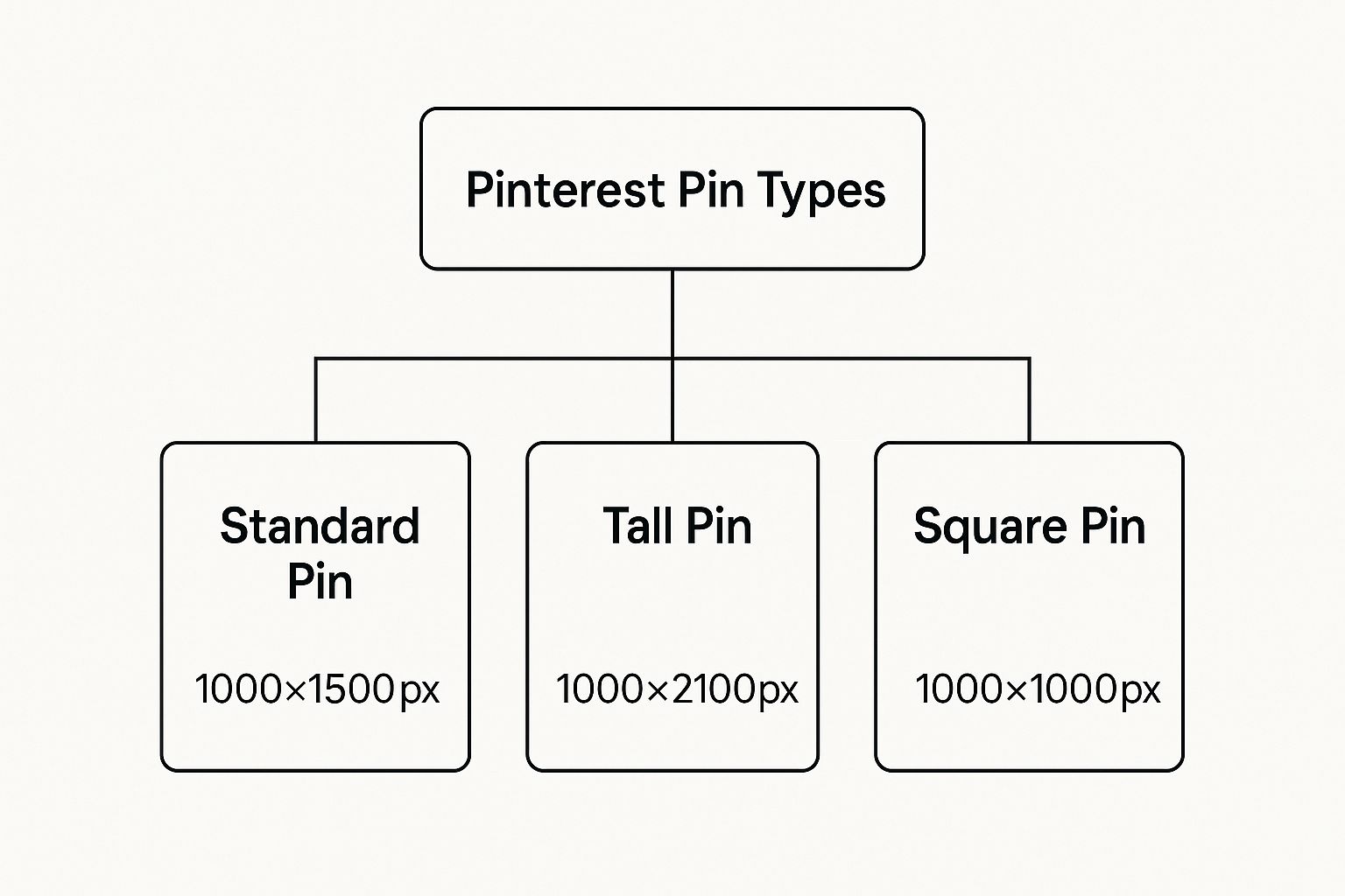
As you can see, the Standard and Tall Pins are designed to own that vertical space, while Square Pins are all about cross-platform convenience.
Square Pins: For Cross-Platform Consistency
Square Pins, typically 1000 x 1000 pixels (a 1:1 aspect ratio), are a really practical choice, especially if you’re repurposing content from other places like Instagram or Facebook.
They’re fully supported on Pinterest and won’t get cropped.
The main catch? They take up less vertical space in the feed compared to a 2:3 Pin. This means they can look a bit smaller and less impactful next to their taller neighbors. Still, for busy creators, their utility is hard to deny.
This kind of cross-platform thinking is key. For instance, just like on Pinterest, mastering optimal Instagram Reel dimensions can make or break your video’s performance. The principle is the same everywhere: design for the feed you’re on.
Choose Square Pins when:
- You’re quickly sharing content straight from your Instagram feed.
- Your image composition is just naturally square, like some product photos or headshots.
- You’re building a Carousel Pin and want every card to have a clean, uniform look.
Ultimately, mastering each Pinterest image size means picking the format that best fits your content’s goal.
While Standard Pins should be your default, knowing how and when to pull out a Tall or Square Pin gives you the flexibility to build a much more effective visual strategy.
Designing Pins That Stop the Scroll
Getting the Pinterest image size right is like pouring the foundation for a house. It’s a critical first step, but the real work—the stuff that makes people want to come inside—happens next.
Once you have your 1000 x 1500 pixel canvas, the magic is all about what you put in that frame. Your creative choices are what will turn a technically correct Pin into one that actually stops the scroll and gets someone to click.
This isn’t about just making something look nice; it’s about smart design that gets results. Every element, from your color palette to your font choice, needs to have a purpose.
Let’s dig into the core principles that will make your Pins truly stand out.
Master the Art of Visual Contrast
Think about the Pinterest feed for a second. It’s a fast-moving, colorful river of content. If you want your Pin to get noticed, it can’t just quietly float by—it needs to make a splash.
The easiest way to do that? High-contrast colors. It’s like using a brightly colored fishing lure in murky water; it’s what grabs the eye first.
Try pairing bold, vibrant colors with clean, light backgrounds, or flip it and use crisp, light text on a dark, moody image. This contrast makes your whole design pop and ensures your message is easy to absorb in a split second.
- Bright on Light: Use punchy colors for your text or key graphic elements against a simple white or pale background.
- Light on Dark: Place clean white or pastel text over a dark photo or a solid-colored background for a dramatic effect.
Here’s a pro tip: Pins with multiple dominant colors tend to perform really well on Pinterest. Don’t be afraid to be bold. A few bright, powerful colors on a simple image can define your brand’s visual style and demand attention.
This strategic use of color is what keeps your Pin from blending into the sea of other images. It makes a statement.
Choose Fonts That Communicate Clearly
The text you overlay on your Pin is arguably its most important feature. It gives immediate context and tells people exactly what they’ll get when they click.
But if they can’t read it, it’s completely useless.
When you’re picking fonts, legibility is everything. Seriously. Ditch the overly decorative cursive scripts or the super-thin fonts that disappear on a small mobile screen.
Instead, go for bold, clear, and easy-to-read sans-serif or serif fonts.
- Font Pairing: Keep it simple. Stick to two complementary fonts at most—one for your main headline and another for any smaller subtext. This prevents the design from looking messy.
- Size Matters: Your headline should be the hero of the image. Make it big enough to be the very first thing someone reads.
Think of your text as a giant signpost on your Pin. It needs to be big, clear, and direct to guide people straight to your website.
Brand Your Pins Without Overwhelming Them
Your logo is your brand’s signature, and placing it consistently on your Pins helps build brand recognition over time. But be careful.
A logo that’s too big or slapped on awkwardly can make your Pin feel too corporate and salesy, which is a major turn-off on Pinterest.
The goal here is subtle, consistent branding.
Find a spot (like the bottom center or a top corner) and put your logo there every time. Keep it small enough that it doesn’t compete with your headline or the main image.
Over time, as people see your awesome content, they’ll start associating your valuable Pins with your brand.
To really level up your visuals, exploring innovative platforms for content and image generation can give you a steady stream of fresh ideas.
Create a ‘Safe Zone’ for Critical Elements
Ever notice how on TV, the important stuff always happens away from the very edges of the screen?
That’s the “safe area,” and your Pins have one, too. Pinterest’s own interface—things like the “Save” button and other icons—can sometimes cover up the corners of your Pin.
To make sure nothing important gets hidden, imagine a small border around your design and keep your text and key graphics inside this “safe zone.” This little bit of margin ensures your whole message is visible, no matter what device someone is using.
For a more detailed walkthrough, our guide on how to create a Pin on Pinterest breaks it down even further.
How Optimal Pin Sizing Impacts Your Business Goals
It’s tempting to think of the Pinterest image size as just another tiny technical detail. Honestly, who has time for that? But treating it as an afterthought is a huge mistake.
The dimensions of your Pins are directly connected to real-world business results—we’re talking traffic, leads, and sales.
Let’s break it down. A perfectly sized Pin is like a sharp, eye-catching ad for your brand. On the flip side, a poorly cropped one is like a billboard with half the words chopped off.
The first one gets clicks and builds trust; the second just creates confusion and gets scrolled right past. Every single Pin is an opportunity, and its dimensions decide whether you grab it or miss out.
Boosting Traffic and Lowering Ad Costs
The most immediate place you’ll see the impact of proper Pin sizing is in your ad performance. When you’re running Pinterest Ads, the algorithm rewards content that gives users a good experience.
A Pin formatted to the recommended 1000 x 1500 pixels fits the feed perfectly, which naturally leads to higher engagement.
This positive feedback tells Pinterest your ad is relevant and high-quality. What happens next? The platform shows it to more people, often at a lower cost-per-click (CPC).
An incorrectly sized ad that looks amateurish or gets awkwardly cropped will fight for every click, driving your costs up and tanking your return on investment. It’s a simple formula: better format equals better performance.
This isn’t just a theory; it’s the core of Pinterest’s business model.
The platform pulled in $3.6 billion in revenue in 2024, a 20.3% jump, largely by creating a visually pleasing ad experience for its users. Interestingly, while only 18% of its users are in the US, that market drives a massive 78% of its revenue.
This just goes to show how crucial optimized content is for connecting with high-value audiences.
For e-commerce brands, a Product Pin is more than just an image—it’s your digital storefront. When a potential customer sees a crisp, professional Pin that clearly showcases your product, it builds immediate trust and credibility.
Creating a Trustworthy Shopping Experience
A sloppy, poorly cropped Product Pin does the exact opposite. It screams “unprofessional” and makes shoppers think twice before clicking through to buy.
When you’re building a brand online, every little detail matters, and high-quality, consistent visuals are the foundation of that effort.
Your Pins are often the very first time a potential customer interacts with your brand. By making sure every image is sized perfectly, you create a smooth, professional journey from the moment they discover you to the moment they check out.
This isn’t just about looking good; it’s about building a brand that people feel confident buying from. Getting your dimensions right is a powerful tool for growth.
Of course, dimensions are only half the story. To ensure your Pins load quickly and perform well, you also need to optimize their file size.
And remember, pairing stunning visuals with the right search terms is what gets you discovered. Check out our guide on Pinterest keyword research to make sure your beautifully sized Pins actually reach the right people.
Turn Perfect Pin Sizes Into a Repeatable Habit
Knowing the ideal Pinterest image size is only useful if it shows up in every Pin you publish. Instead of treating dimensions as a one-off detail, bake them into your workflow so they become automatic.
Here’s a simple way to put this guide into practice starting now:
- Lock in your default canvas: Set 1000 x 1500 px (2:3) as your go-to template in your design tool for all new Pins.
- Create format-specific templates: Add separate templates for Tall Pins (max 1000 x 2100 px) and Square Pins (1000 x 1000 px) so you’re never guessing or eyeballing.
- Add a quick “size check” step: Before exporting, confirm the aspect ratio and keep key elements (headline, logo, CTA) inside a safe zone away from the edges.
- Test and track: Publish a mix of properly sized Standard, Tall, and Square Pins and watch which formats drive the most saves and clicks in your analytics.
If you run this process every time you design, you’ll stop losing clicks to awkward crops and start turning every Pin into full-screen, on-brand real estate that actually works for your business.
Ready to Make Perfectly Optimized Pins Your New Normal?
Knowing the right Pinterest dimensions is step one—actually using them on every Pin is what moves the needle.
Use PostPaddle’s FREE Pin Optimization Checklist as a quick final pass before you publish, so you get in the habit of reviewing each Pin for key details like size, cropping, and overall clarity.
Turn every Pin into a fully optimize in minutes.
Got More Questions About Pinterest Image Sizes?
Once you’ve got the basics down, you’ll probably still run into some specific, nitty-gritty questions. Honestly, getting these little details right is what often separates a Pin that gets a few clicks from one that really takes off.
Let’s clear up some of the most common points of confusion I see people run into. Getting these answers straight will help you create Pins with confidence, every single time.
1. Can I Use Images That Aren’t a 2:3 Ratio?
You can, but I almost always advise against it. Think of Pinterest’s feed as a vertical art gallery.
The platform is built around that tall, 2:3 aspect ratio. When you pop a square (1:1) image in there, it just doesn’t command the same attention. It gets less screen real estate and can easily be overlooked next to its taller, more impressive neighbors.
Anything too tall (beyond a 1:2.1 ratio) or horizontal is even worse.
Pinterest will chop it off in the main feed, hiding your catchy headline or the most important part of your visual. If a user can’t see the whole picture, why would they click? Stick to the 1000 x 1500 pixel standard.
It’s the safest bet for consistent, reliable results.
2. What’s the Maximum File Size for a Pin?
Pinterest gives you a lot of wiggle room here, but don’t take that as a challenge to upload the biggest file you can. A massive file is a slow file, and that’s a killer for user experience.
Here are the technical limits:
- Static Images (JPG, PNG): Up to 20 MB.
- Animated GIFs: Up to 100 MB.
- Video Pins: Up to a whopping 2 GB.
But here’s the reality: no one on a spotty mobile connection is waiting for a 15 MB static Pin to load. They’ll just scroll right past it.
I always tell my clients to aim for high-quality static images that are well under 10 MB after compression.
Remember, a fast-loading Pin keeps people engaged. A slow-loading one gets scrolled past. Optimizing your file size is just as important as getting the dimensions right.
3. Does Pinterest Penalize Incorrect Image Sizes?
Pinterest won’t send you a warning or officially “penalize” your account for using the wrong size. But the outcome is pretty much the same.
The algorithm’s entire job is to show people content they’ll love and interact with.
When your Pin is awkwardly cropped or blurry, people don’t engage with it.
They don’t save it, they don’t click it, and they don’t comment. That lack of positive feedback tells the algorithm, “Hey, users don’t find this very valuable.”
As a result, your Pin gets shown to fewer and fewer people. So, while it’s not a direct penalty, you’re effectively penalizing your own reach by not following the platform’s best practices.
4. What’s the Easiest Way to Resize Images for Pinterest?
You absolutely do not need to be a graphic design whiz to nail this. The key is to use a good, user-friendly design tool.
Platforms like Canva are fantastic for this. They come loaded with pre-made Pinterest templates already set to the perfect 1000 x 1500 pixels. If you have a photo you want to use, you can just drop it in and use their resize features. Free tools like Adobe Express work great, too.
For those who want more precise control, something like Adobe Photoshop is the industry standard.
My best advice?
Always start with the highest-resolution image you have. When you resize, lock the aspect ratio first to avoid stretching or distorting your image, then crop it down to that perfect 2:3 ratio.
